
Affiliate Payout Modifier
Full Stack Web Application
Affiliate Payout Modifier (APM) is a tool used by the analytics team to manage & modify revenue share for leads based on performance during a given day or time period.

Overview
The Problem
-
User flow is very fragmented
-
Setup has too many steps
-
Table views need to be cleaned up so pertinent information is easily accessible
-
Stakeholders want to move away from the table view and show information using a more modern UI
Skills
Interviewing
User Research
User Flows
Wireframes
Prototypes
User Testing
The Solution
-
Add a quick setup form allowing user to create an APM, create a schedule and add a KPI all in one place
-
Add widget view allowing users to see current APMs, schedules & KPIs at a glance
-
Group schedules & KPIs based on criteria instead of by day so user can multi-edit
Tools
Figma
Adobe Illustrator
Google Suite
Product Overview
Key Features
-
Favorite button: Access your accounts more quickly from the table view
-
APM Quick Set Up: Set up multiple schedules and KPI ranges in one form
-
Toggle between different views
-
Widget View: See all schedules & KPI range criteria at a glance
-
Multi-edit: Change multiple parameters at a time
Research & Understanding
My first step in starting this project was learning about and understanding what APM was, how it is currently being used, and defining any terms I did not know. Before diving into a project, I find it very important to have a deep understanding of what I am working on so I can be sure to ask well informed questions.
What is APM (Affiliate Payout Modifier)?
APM is a tool used by the SuCo analytics team to help manage and modify what percent of revenue share affiliates get paid based on multiple criteria. The team can set up a schedule to modify payout by a percentage or dollar amount. Once a schedule is set, they can add multiple KPI ranges to determine the payout.

Table Schema

When doing my research I found that I had to take a deep dive into the table schema. This allowed me to understand what information was already available and could be used in the new design without creating additional back-end work. Any updates to the schema would need to be approved before moving forward, and due to our tight deployment timeline it was important to make minimal back-end changes.
Understanding User Problems
The main problem users where having with the current application was how fragmented the user flow was. Set up was taking a much longer time than necessary because each APM, Schedule and KPI range needed to be set up and saved one at a time. As analysts monitored traffic and needed to make schedule changes, they then needed to go into each individual day to make changes. Users found this process to be too lengthy, so as a workaround they would instead delete entire schedules and remake them to save time. Not only was this inefficient, but it was causing errors when they wanted to look back at the payout history.

Initial Sketches
After speaking with users and learning about the issues they were having, I began with sketching paper prototypes. Since I knew the updates would be complex and making wireframes in Figma would be very time consuming, I wanted to start on paper to ensure I was heading in the right direction. I sketched my two main ideas as options to review with the front-end team to ensure they would be possible to implement. Once I discussed my ideas with the front-end team, I presented them to key users in order to land on an option to prototype and to start the iterative process.

Prototypes
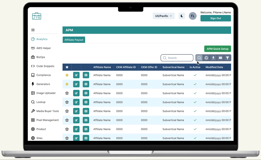
Table View
Before

-
Table is difficult to read
-
"Search By" function is cumbersome
-
Too many buttons up front making it harder to get to more important information
-
No hierarchy between buttons
After

-
Added color to rows and header making it easier to read
-
Updated table tools
-
Hid less pertinent information such as table ID (can be viewed when selected in custom column tool)
-
Made main CTA clear and distinct from other buttons
-
Added favorite button so Account Managers can easily find their affiliates
-
Moved history and trash icon buttons to the end of the row leaving more room to show important information
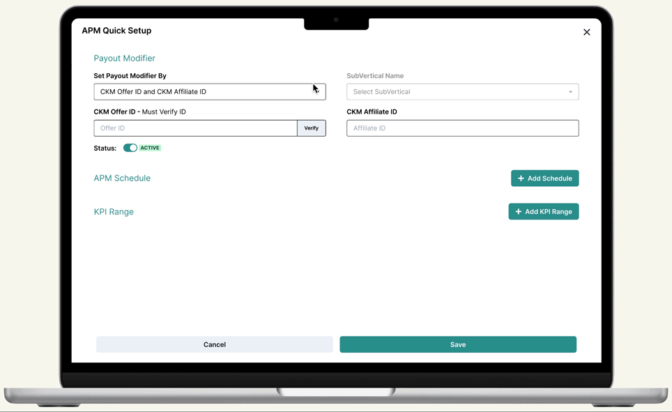
Quick Set Up Form

I added this form so users could set up a Payout Modifier, Schedule and KPI Range in one form. Users can set up only the payout modifier if they don't have the other information ready, or can choose to add a schedule and KPI range by clicking the "Add" button. See full form details in the image to the right.

Details View
Before
-
Detail and Schedules/KPI tables were in separate tabs
-
Can only view Schedules/KPIs in a table view
-
Table rows are saved by day
-
Users cannot multi-edit


After
-
View and edit Details, Schedules and KPI Ranges on one page
-
Toggle between updated widget & table views
-
Edit by criteria instead of day
-
View all information at a glance without horizontal scrolling

Iteration
Quick Set Up Form - Updated
After presenting mocks to key users, I learned that it would be more helpful if in the quick set up form, users could add more than one schedule and KPI range at a time. This meant there needed to be changes to the UI in order to prevent the form from getting extremely long, making it more difficult to spot errors.
Next Steps...
Testing & Iterations
At Suited Connector we work in an agile environment and deploy 2 times a week, allowing many opportunities for bug fixes and iteration. As users get used to the new updates and have further comments we will continue to add tickets to adjust where necessary.
In addition to APM, the analytics team uses a similar app called MMA. We plan on seeing how testing goes for APM before implementing updates to MMA so we can use our finding to make informed updates.